Case study · ecommerce
Bythen Store
A Web3 store where you understand the product before you connect a wallet.
Bythen Store sells NFT-based products: collection access, free trials, pre-orders, and entry to the Bythen AI companion ecosystem. Most Web3 stores ask you to connect first and explain later. I built this one the other way around. Solo on UX, inside a launch team, in under three weeks.
The problem
A Web3 store carries baggage a normal store does not. Before a user acts, they have to answer:
- Which collection do I need to qualify?
- What happens after I connect my wallet?
- Is this a mint, a claim, or a purchase?
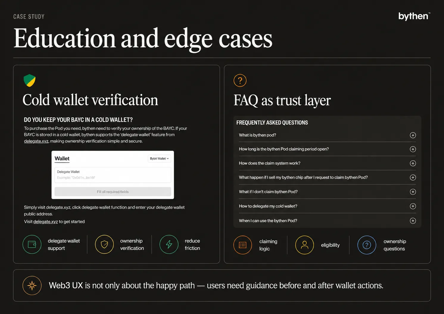
- My NFT sits in a cold wallet I never connect. Am I locked out?
- What does owning this actually unlock?
Experienced holders skim past these. New users stall on them. The store had to serve both without turning into a wall of crypto instructions, and without burying the answers in a help center the user leaves the page to find.
The solution: two layers, two jobs
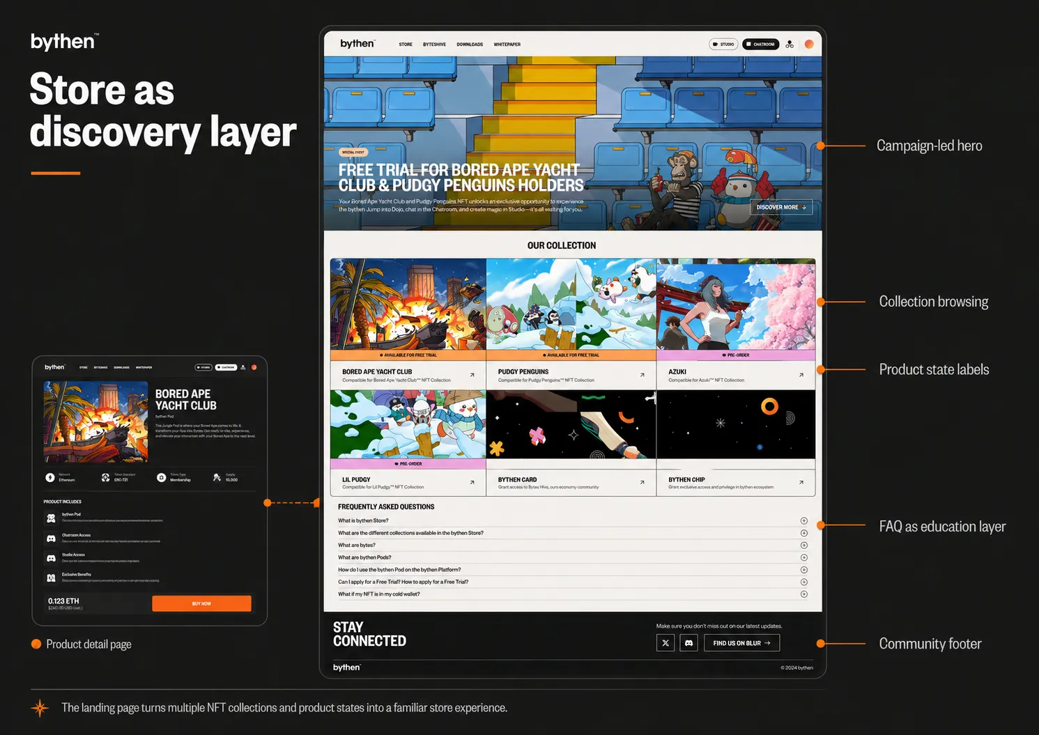
I split the experience into a discovery layer and a decision layer.
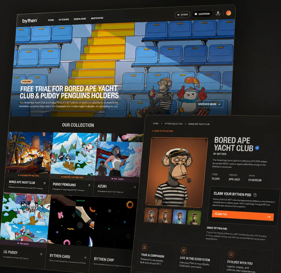
The landing page answers “what’s here.” A campaign hero, then a collection grid. The grid does the heavy lifting: it turns separate NFT communities and product types into one scannable pattern, so users compare collections and availability instead of decoding each product from scratch. State labels (free trial, pre-order, buy) sit on the cards, so what you can do is visible before you click.
The product detail page answers “should I act.” The BAYC page opens with the collection visual and two paths: try free, or buy. Below that, I explain what the Jungle Pod does before asking for anything, that it brings a Bored Ape into the Bythen ecosystem as an interactive AI companion, not just a collectible. Feature cards show what access unlocks: personalize your Byte, talk to it, make content, join the ecosystem.
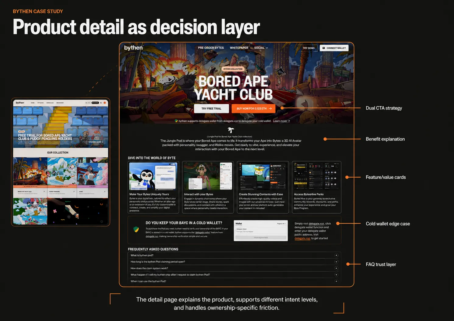
The rule across both pages: lead with the offer, ask for the wallet last.
My role
I owned the UX for both pages across desktop and mobile: structure, hierarchy, copy, interaction and motion direction, prototype, and handoff. The decisions I want to be judged on:
- Two-layer split. Discovery and decision are different jobs. Collapsing them into one page is the default mistake; I kept them apart.
- Benefit before mechanic. No wallet prompt until the user knows why the product matters.
- Edge case on the page, not in a doc. The cold wallet flow lives inside the journey, not in support.
- FAQ as onboarding, not footer filler. The product mixes Web2 browsing with Web3 ownership, so questions about claim periods, eligibility, and what happens after you sell a chip became part of the flow, placed where the hesitation happens.
I also briefed and reviewed the illustrations, checking each one earned its place in the product message instead of standing alone as art.
The hardest decision: cold wallet ownership
A user can own an eligible NFT and keep it in a cold wallet they never connect to a website. A plain connect-wallet check reads that user as ineligible and blocks them. Real owner, wrong answer.
I put a delegate-wallet section directly on the product detail page: connect a hot wallet, prove ownership of the cold one, keep moving. This pulled an ownership-verification problem out of support tickets and into the page where it blocks people.
This is the decision I am most confident about. It solves a real Web3 failure where the happy path quietly excludes legitimate buyers.
Constraints and collaboration
Under three weeks, with design, development, and illustration running in parallel. While I designed flows, developers worked through wallet and ownership limitations and illustrators were still drawing. That forced trade-offs: some flows I wanted got cut to match what the contracts and the timeline allowed.
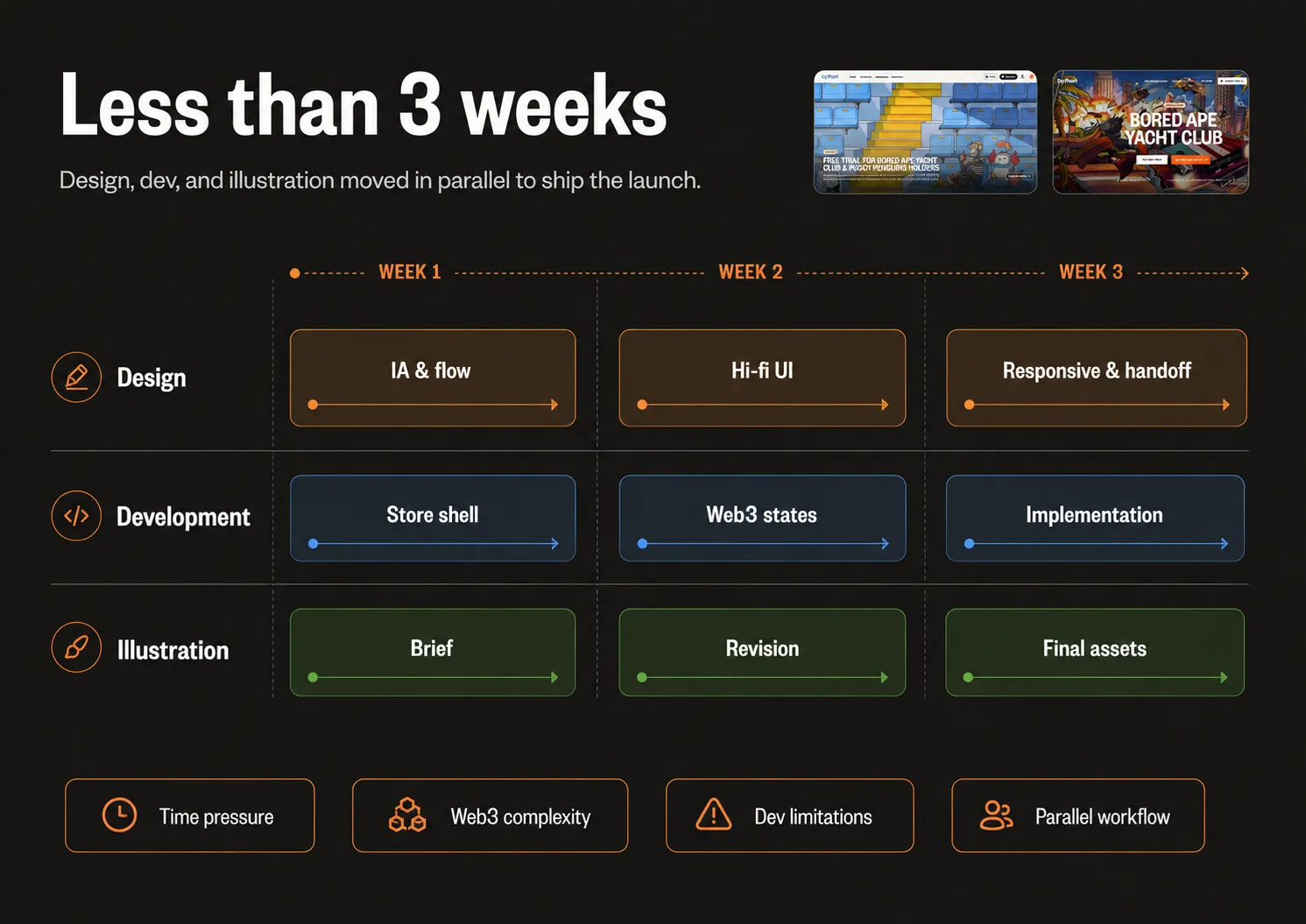
For handoff I delivered responsive layouts, a prototype, UX copy, interaction and motion notes, and implementation guidance, written so developers building in parallel could move without waiting on me. On motion I stayed restrained: hover feedback, CTA emphasis, section transitions. Enough to signal state and guide the eye, nothing that competes with the product.
Outcome
The store launched and moved product within hours:
- Jungle Pods sold out their launch batch in the first hours.
- Holders paired their NFTs to a Pod through the free trial in volume.
Both signals point the same way: users did not just browse, they connected, qualified, and committed. The free-trial pairing matters most to the design argument. It says the try-before-you-buy path I built carried weight, not just the direct purchase CTA. Beyond launch, the two-layer structure gave Bythen a reusable pattern for future drops instead of a one-off page.
What I took from it
Web3 UX is not about hiding the mechanics. It is about sequencing them: show the value first, introduce the wallet actions in order, and surface the edge cases before they turn into dead ends. The cold wallet section taught me the clearest lesson. The fastest way to look trustworthy in Web3 is to answer the question the user is afraid to ask, on the page, before they ask it.