Case study · design-system
Stockbit Design System
Building a fintech design system from zero, where the hard part was getting people to use it.
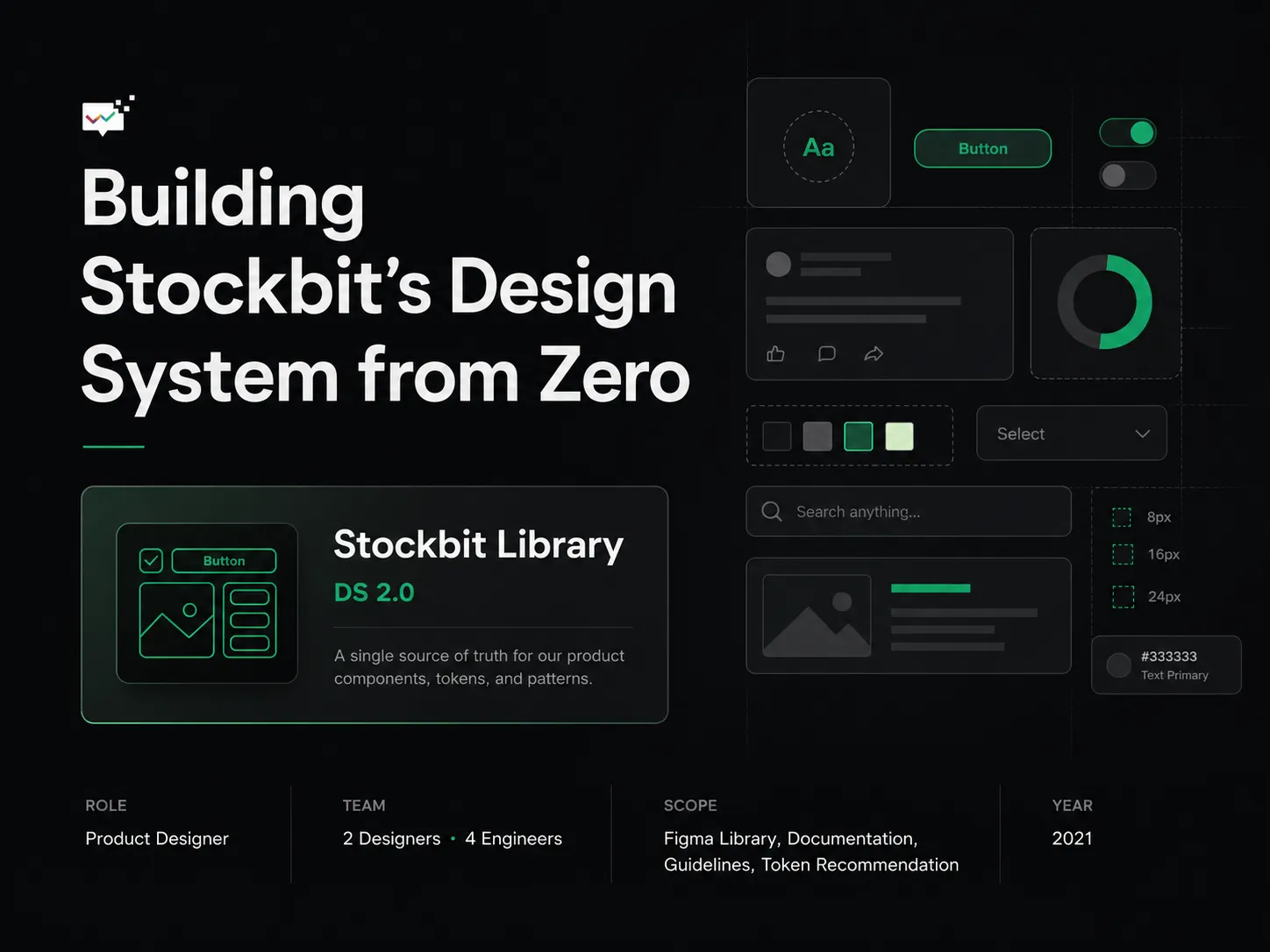
When I joined Stockbit, the product design team had no shared component library. Designers rebuilt the same patterns by hand for every feature, and the interface drifted apart as the product and the team grew. I started a shared library to fix that. It became Stockbit Library: components, documentation, guidelines, and token recommendations that connected design and engineering across iOS and Android. Two designers, four engineers. The hard part was never building it. It was getting people to use it.
The real problem: adoption, not components
Stockbit had never had a formal design library. Designers built custom components under deadline pressure. Engineers interpreted design decisions from scattered files. The longer that ran, the harder consistency got.
I could have shipped a clean Figma library and called it done. It would have sat unused. A design system earns its keep only when people reach for it instead of building around it. So the question that shaped the project was not how to build the library.
How do we get people to actually use the system?
What was blocking adoption
I talked with the designers and engineers expected to use the library day to day. Three barriers came up.
Visibility, not resistance. Some people were open to contributing but didn’t know the library existed, or that they could add to it. The problem wasn’t pushback. The system was invisible.
Deadlines beat the library. Under delivery pressure, building a custom component felt faster than searching the library, asking, or waiting for guidance. The system had to fit inside real workflows and support speed, not add a step.
Unclear usage and mismatched tokens. Designers weren’t sure how to use the Figma library; engineers needed clearer references for behavior and implementation. Naming and tokens made it worse: iOS and Android engineers used different conventions, camelCase and snake_case, so the system had to flex across platforms without losing one shared meaning.
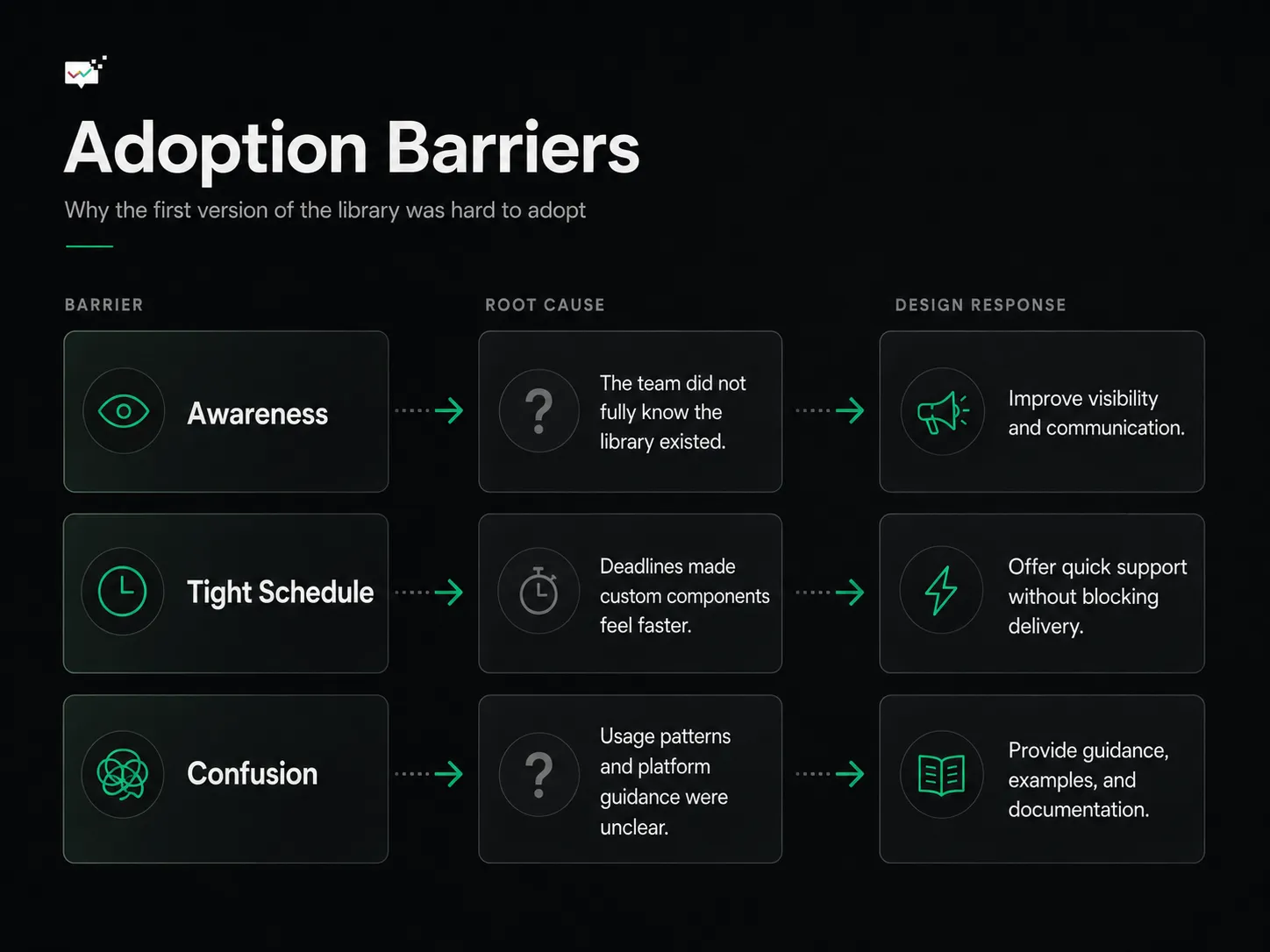
Mapping the adoption barriers showed the gap wasn’t component availability. It was visibility, workflow pressure, and unclear guidance.
Defining the problem
I mapped the root causes with a problem tree. One thing stood out: the system took too much effort to understand. People were busy. They needed to ask questions, weigh component decisions, and learn the reasoning behind the system without derailing their timeline. Documentation alone wouldn’t carry that. The team needed a direct, low-risk place to discuss use cases and decisions together.
Building the foundation
The first version of Stockbit Library gave the team a working foundation:
- a Figma component library
- documentation for component usage
- visual and interaction guidelines
- foundational decisions like color usage and hierarchy
- token recommendations that read cleanly on both Android and iOS
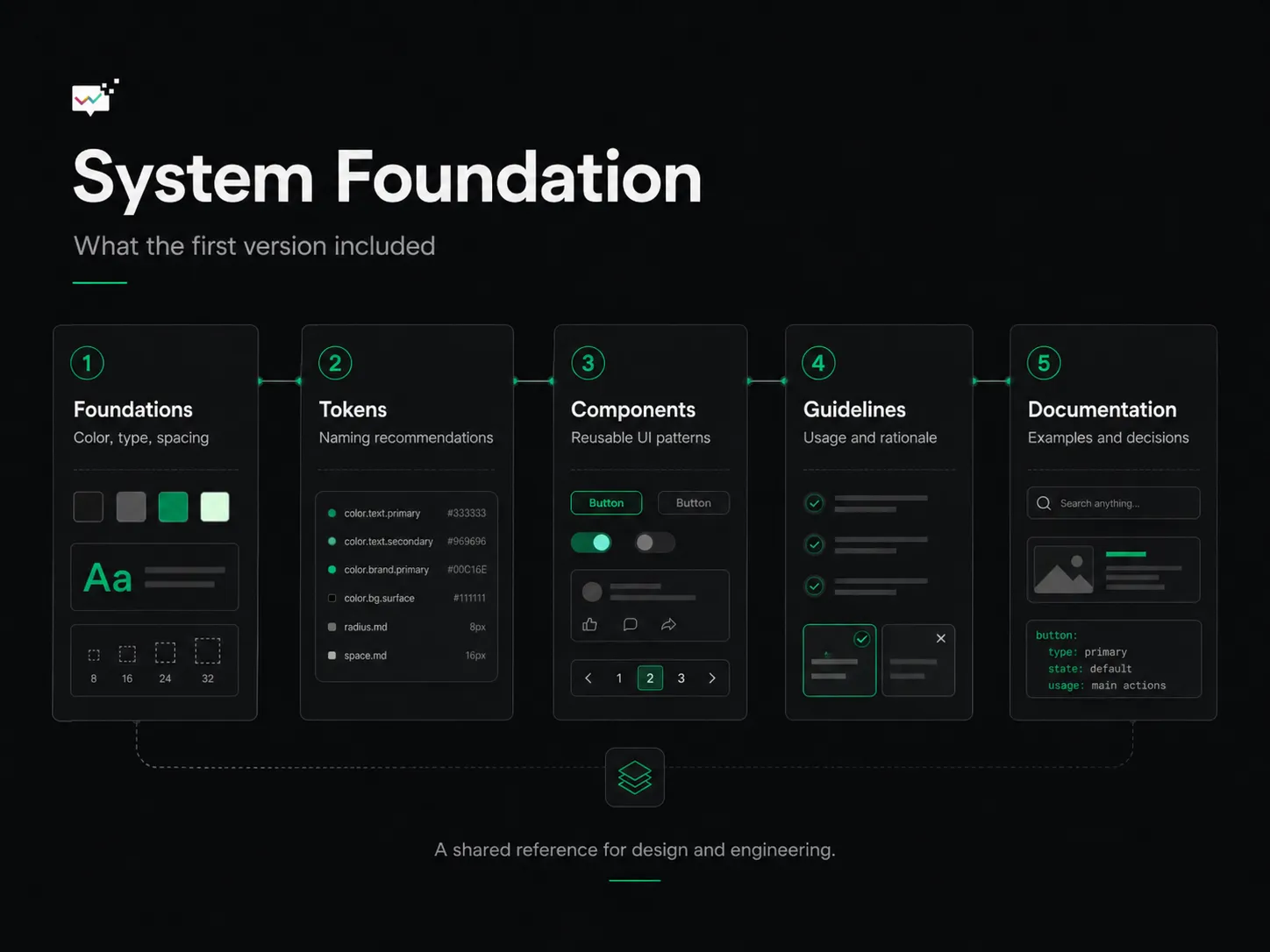
The first version created one shared reference across foundations, tokens, components, guidelines, and documentation.
Tokens were the hard part. Each platform had its own implementation preferences, camelCase on one side, snake_case on the other. Instead of forcing a single naming style early, I defined a shared structure and recommendation that kept design and engineering aligned while each platform kept its own syntax. The design intent stayed fixed; the spelling adapted.
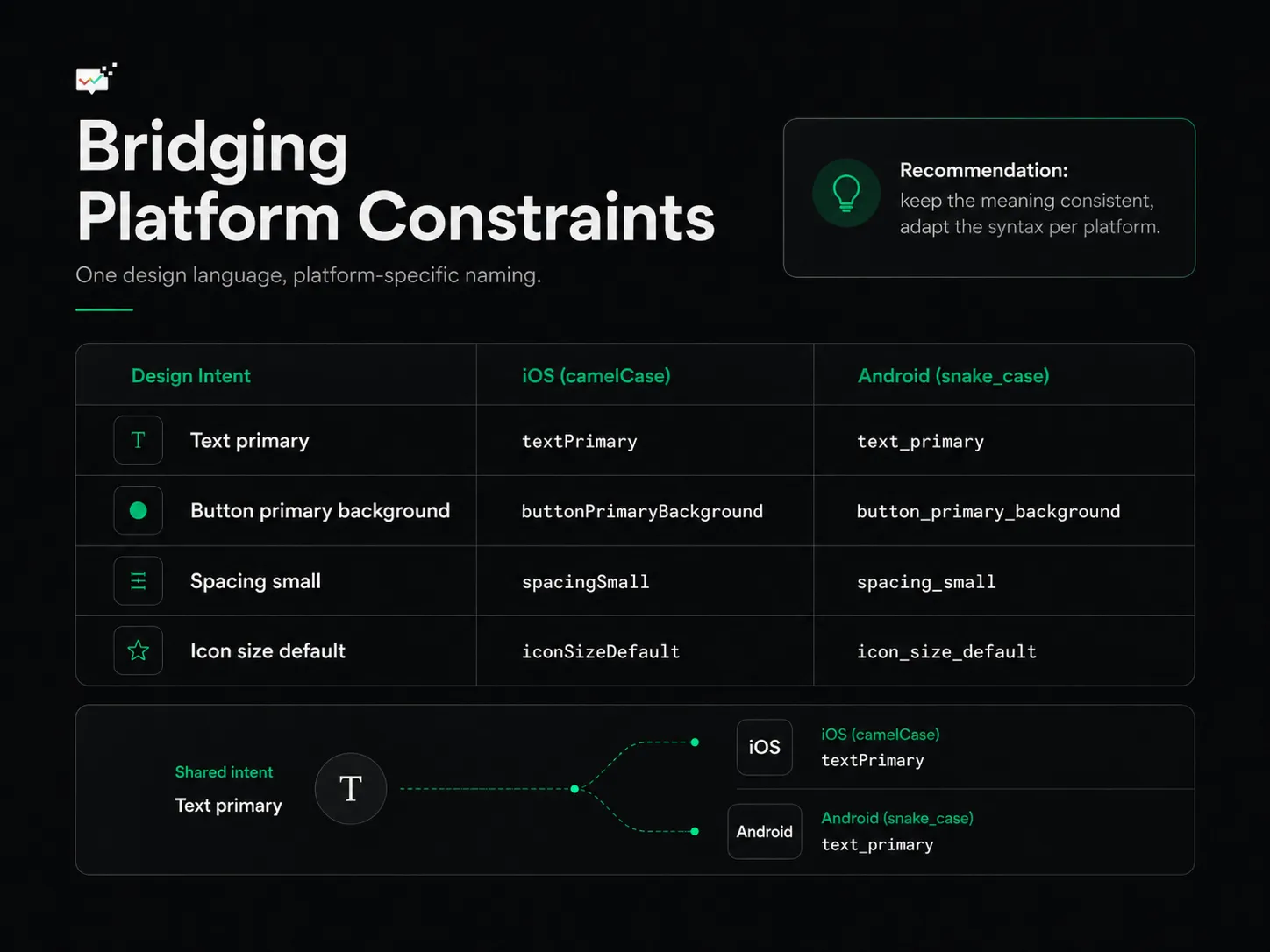
Token recommendations held the design intent steady while letting the syntax adapt to each platform’s constraints.
That turned the library from a Figma file into a shared reference for how the product should look and behave across the experience.
The solution: make help easy to reach
During the pandemic the team already ran a recurring Google Meet room and an active Slack channel. Instead of building a heavy review process, I used what was already there.
The idea was small: let designers and engineers reach the design system team the moment they needed guidance. Drop into the open Meet session, or ask in Slack, instead of waiting for a formal review. People brought their project context, explained what they were solving, and we worked out whether an existing component fit or the system needed to grow.
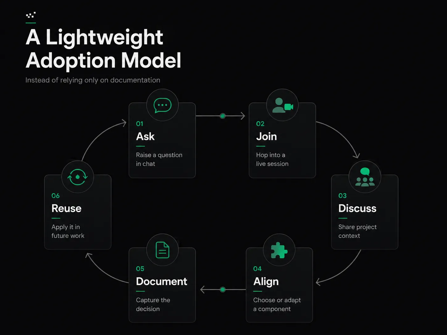
Instead of leaning on documentation alone, we built a lightweight habit: ask, join, discuss, align, document, reuse.
It made the system approachable. Asking stopped being a process and became a habit.
Validating it
I tested the approach with a small group of designers starting new projects. Each one paired with a design system designer to talk through their specific problem. The goal wasn’t to make them use the library exactly as built. It was to help them make better decisions with shared guidelines and reusable components.
The response was positive. Designers started seeing the system as a way to make more scalable decisions and skip unnecessary custom work, not as a limit on creativity. One designer told me that being able to ask and discuss on the spot was what made component scalability click for them.
That was the signal: adoption improved when the system felt collaborative instead of restrictive.
Design guidelines
As the library grew, I documented guidelines alongside the components, foundational elements like color usage, hierarchy, and worked examples. They covered not just what to use, but why and when. A design system shouldn’t only hand people UI parts. It should help them make consistent decisions across different product contexts.
Impact
We didn’t track formal metrics at the time, so I won’t claim numbers. The change showed up in how the team worked. More designers used the library. Component discussions got more deliberate. People asked questions earlier instead of guessing. Engineers had clearer references when turning design into code. After about nine months, the interface looked more consistent because more teams designed from the same foundation.
The real result wasn’t the component library. It was the behavior around it: a shared space where design and engineering could collaborate, learn, and decide together.
What I took from it
Building a design system isn’t mainly about building components. It runs on trust, clarity, and contribution. People need to know why the system exists, how it helps them, and how they can shape it. Adoption doesn’t happen on its own. The most useful library in the world gets ignored if people can’t find it, contribute to it, or talk about it openly. To make a design system work, you design it around people, not just interfaces.
What’s next
The first version worked. Scaling it was the next problem. As the product kept growing, the system needed tighter organization, better documentation, and support for platform updates, or it would rot.
How do we scale Stockbit Design System without it becoming a design system graveyard?
That question set up the next phase: turning a working component library into a system that could last.